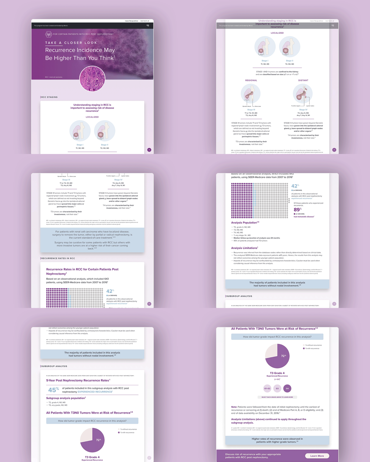
DIRECTED UX efforts for a pharmaceutical client, overseeing research, low-fidelity design, and handoff prep to support HCP and patient engagement tools.
MANAGED a Senior UX Designer and digital team to deliver on-brand assets and streamline dev collaboration, improving delivery speed and stakeholder alignment.
Problem Statement
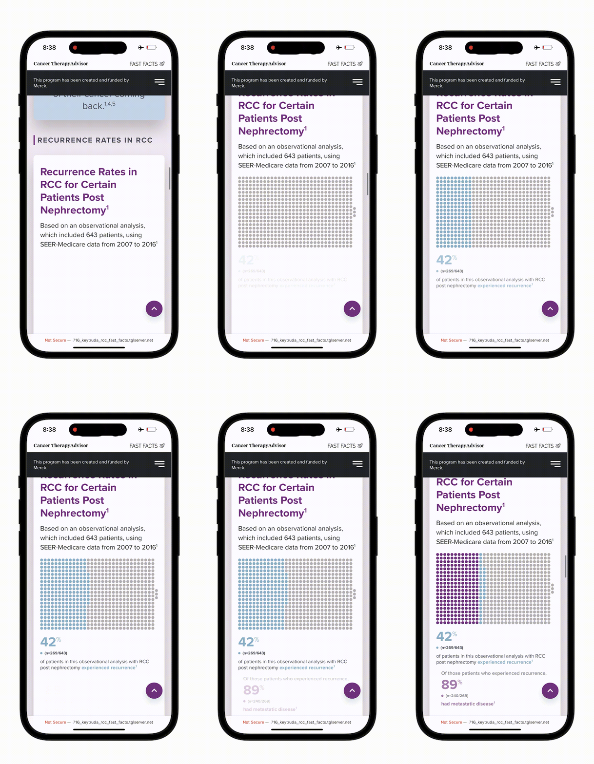
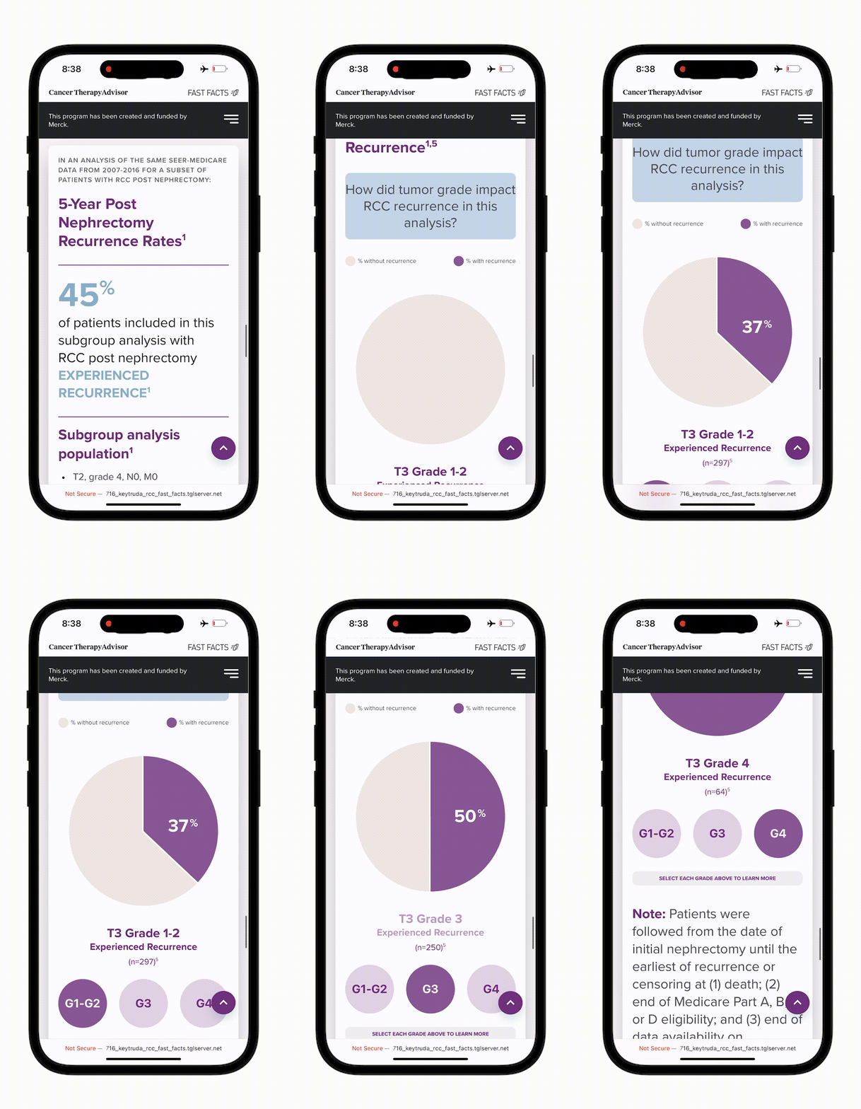
The challenge was to transform the manuscript into an engaging, scientifically accurate presentation of data, tailored for healthcare providers primarily using mobile devices. This required overcoming development limitations, especially with animating charts. The main objectives were to facilitate quick, engaging data consumption while maintaining scientific accuracy and to design graphics with a mobile-first approach to optimize the user experience. The business goal was to keep healthcare providers engaged with all data points.
Research & Discovery:
User Research: We analyzed previous Merck projects to assess how long healthcare providers engaged with charts and infographics on mobile devices and identified the most interacted-with content types. This analysis yielded valuable insights into user behavior and preferences.
Personas & User Scenarios: We didn’t engage with personas for this particular project.
Key Insights: Healthcare providers preferred minimal and direct content over flashy animations, highlighting that simplicity and clarity were crucial for their engagement. These insights were derived from analyzing data and heatmaps from previous products for this client.
Ideation & Concept Development:
Brainstorming & Ideation: After discovering that animations didn’t improve user engagement, we collaborated with scientific writers to streamline the content while preserving its scientific accuracy, making it more user-friendly and precise.
User Flows & Journey Maps: Given the single-scroll page format, we structured the content as a narrative, guiding users through the data in a logical and engaging way.
Design & Iteration:
Usability Testing & Feedback: Due to time and budget constraints, formal usability testing wasn’t possible. Instead, I facilitated an internal testing and feedback session with our client services and sales teams. This helped secure buy-in for streamlining content, aligning it more closely with our business goals.
Development & Collaboration:
Handoff to Developers: I collaborated with the development team from the project’s outset, using CodePen and CSS examples to explore mobile capabilities. The team received early access to the Figma file, and we regularly discussed updates before the official handoff.
Collaboration: This project at Haymarket was highly collaborative. We involved the development team early to evaluate the feasibility of animated charts on mobile. The scientific team also played a key role in streamlining content without compromising accuracy. We conducted work sessions with the client midway through the project, demonstrating that effective engagement didn’t require all content to be animated to retain users on the page longer.
Outcome & Impact:
Results: Surpassed engagement goals with increased time on page and positive usability feedback.
Business Impact: Boosted user engagement and conversions through a mobile-first, minimalistic design.
User Impact: Data-driven approach reduced client concerns and streamlined collaboration.
Reflection & Learnings:
Successes: Cross-team collaboration effectively solved complex issues.
Challenges: Initial resistance to mobile constraints was overcome with data-backed decisions, aligning all stakeholders.
Lessons: Emphasized the importance of transparency and collaboration to build trust and align design goals.
Conclusion:
Summary: This project underscored the value of a collaborative, data-driven approach, demonstrating my ability to deliver strategically sound, user-focused solutions.


